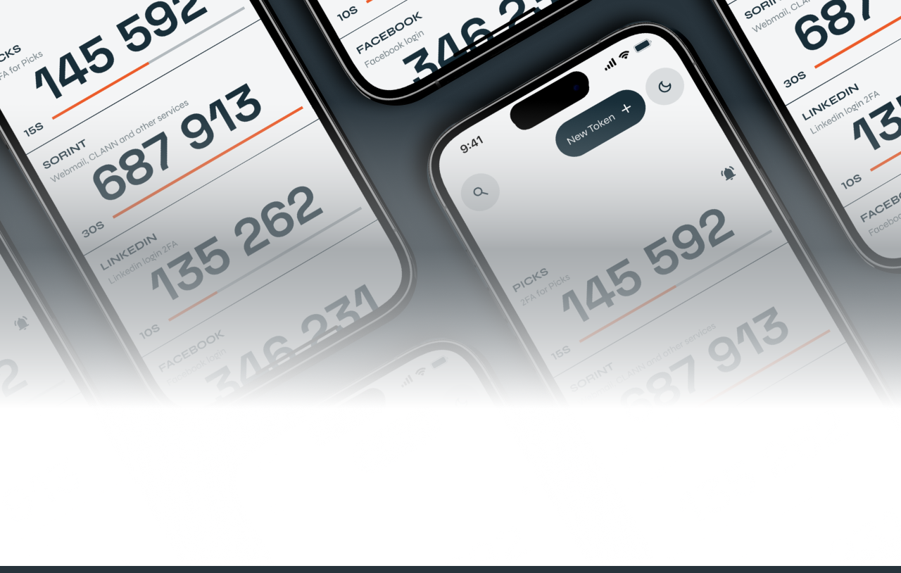
UX user testing: lo use case di Easy 2FA
-
Graziella Dramisino
- 20 Mar, 2023
- 06 Mins read
(English version below)
Nell’ambiente di sviluppo si tende spesso a confondere l’esperienza personale che si ha con un determinato servizio o prodotto, con i desideri e le esigenze dei nostri clienti e dei nostri utenti. La verità è che non si può mai creare un sito web/app user-friendly senza parlare con gli utenti stessi e guardarli mentre interagiscono con il prodotto che si sta sviluppando. In questo articolo, troverete perché condurre degli user testing è importante con un esempio pratico su come il sircle di Product Office ha contribuito a migliorare l’esperienza e l’interazione degli utenti per una app nuova di zecca: Easy 2FA, sviluppata dal sircle MoDe.
I test di usabilità fanno (o dovrebbero far) parte della fase di progettazione di ogni prodotto o servizio: attraverso questo strumento, si testano prototipi o funzionalità specifiche, impostando determinate attività da far svolgere agli utenti.
Cosa ci fanno capire questi test? La lista sarebbe lunga, ma citeremo solo alcuni punti: chi è il vero target di utenti, di cosa hanno bisogno, perché dovrebbero aver bisogno del nostro prodotto e soprattutto come si inserirà nella loro vita quotidiana. Significa individuare eventuali problemi e non far perdere tempo al team che molto spesso si trova costretto ad "aggiustare" la cosa sbagliata: il vostro tempo e il vostro denaro vengono investiti e indirizzati verso il problema giusto. Ok direte, ma in termini pratici quali altri benefici porta?
- Tassi di conversione migliori: osservando gli utenti si scoprono dove e perché non migliorano.
- Si risparmia denaro: ad esempio, risolvere un problema dopo lo sviluppo è fino a 100 volte più costoso di quanto sarebbe stato prima con una stima del 50% del tempo di progettazione dedicato alla rielaborazione.
- Le richieste di supporto diminuiscono: se l’utente è più soddisfatto significa meno esigenze di supporto: riceverete meno domande ridondanti.
È sempre fondamentale tenere a mente l**'esperienza dell'utente** perché alla fine sarà il tuo utente, non il designer o lo sviluppatore, a dover utilizzare il prodotto.
Ma come sono stati condotti questi test?
Come già scritto sopra, i test, sono stati svolti con persone reali che potessero rientrare nel target di potenziali utenti e quindi fruitori del servizio, condizione fondamentale se si vogliono scoprire problemi che non rientrano nemmeno nelle euristiche di design. Per euristiche di design si intendono delle “regole” guida che definiscono, almeno teoricamente, come deve essere costruito un prodotto, tenendo in considerazione necessità e problematiche tipiche dell’utente. Definito questo concetto base, abbiamo deciso di familiarizzare in prima persona con l’app, in modo da conoscerne punti forti, punti deboli e sviscerare ogni possibile azione all’interno di essa. Questo passaggio ci ha permesso di definire in maniera chiara il perimetro di azione dell’app, per intenderci, capire cosa potesse e cosa non potesse invece fare.
Ecco che a questo punto, confrontandoci anche con il team del sircle MoDe, siamo stati in grado di conoscere quali fossero le funzionalità base da testare, quelle che costituivano il core dell’applicazione, una sorta di MVP. Cosa importante da tenere a mente, non tutti i prodotti/app/servizi si prestano alla stessa metodologia di test, per cui esplorare prima ciò che si vuole testare è fondamentale per definire cosa vogliamo capire, in quale modo e in quale contesto (se possibile). Abbiamo deciso quindi che il test si sarebbe svolto su due piani, uno dove l’utente avrebbe cercato di completare alcuni task andando da A a B nel modo che più avrebbe ritenuto corretto, mentre il secondo livello sarebbe stato quello dell’osservazione dell’utente lato nostro. Essendo sempre in due designer (Davide Belotti e Susanna Cenati) a moderare gli incontri con gli utenti, un designer ha condotto il test interfacciandosi con l’utente, mentre il secondo designer ha osservato comportamenti ed eventi degni di nota, più sul piano qualitativo (per esempio difficoltà a raggiungere un tasto nell’app).
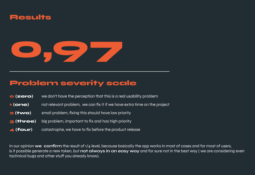
Ogni task ha risposto ad una scala di gravità da zero a quattro, dove zero sta a significare “nessun problema” e quattro “catastrofe”, nel senso di fix necessario in maniera imminente. In questo modo abbiamo potuto introdurre una metrica precisa per la misurazione della prestazione dell’app, una metrica che può dare un’idea precisa di come migliorare e quantificare la qualità in maniera tangibile.
In sintesi, facendo la media delle prestazioni dell’app con i singoli utenti, abbiamo riscontrato un punteggio di 0.97, ovvero un punteggio di 1 su 4 che corrisponde a minimi problemi, ma più che altro qualche punto migliorabile con priorità non elevata a cui si aggiunge il report qualitativo nato dall’osservazione dell’utente, che ci ha restituito insight interessanti per migliorare l’usabilità dell’app.
Al netto quindi delle scelte che poi verranno prese in relazione a tempo, budget, risorse e posizionamento di mercato, siamo stati in grado di generare un report dettagliato, con una metrica dettagliata utile anche per misurare miglioramenti o peggioramenti dell’usabilità dopo possibili rilasci futuri.
Graziella Dramisino & Davide Belotti
English version
The desires and needs of our clients and users are frequently confused in the development environment with our personal experience with a given service or product. You can never create a user-friendly website/app without talking to the users and watching them interact with the product you are developing. In this article, you will find out why conducting user testing is essential with a practical example of how the Product Office sircle helped improve the user experience and interaction of a brand new app: Easy 2FA, developed by MoDe sircle.
Usability tests are (or should be) part of the design phase of each product or service. Through this tool, prototypes or specific features are tested, setting certain activities for users to perform.
What do these tests tell us? The list would be long, but we will mention just a few points: who is the real target of users, what they need, why they should need our product and above all how it will fit into their daily life. It means identifying any problems and avoid waisting time for the team, who very often find themselves forced to "fix" the wrong thing: your time and money are invested and directed towards the right problem. Well, you’ll say: “what other benefits does it bring?”
- Better conversion rates: By observing users, you can learn where and why conversion rates aren't improving.
- Reduces costs: For example, solving a problem after development is up to 100 times more expensive than it would have been before with an estimated 50% of design time spent on rework.
- A lower number of support requests: if the user is more satisfied, it means fewer support needs: you will receive fewer redundant questions. It's always important to keep the user experience in mind because the product will be used by the user, not the designer or the developer.
So, how did we perform these tests?
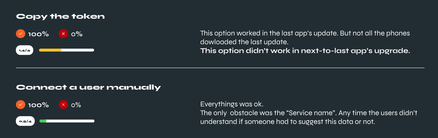
As already said, tests were conducted with real people who fit the target of potential users of the service, a fundamental condition to discover problems not included in the design heuristics. Design heuristics are “rules” which define, in theory, how a product has to be built, keeping in consideration typical user needs and issues. Defined this basic concept, we decided to familiarise ourselves with the app first-hand, in order to get to know its strengths, and weaknesses and to dissect every possible action within it. This step permitted us to clearly define the area of action of the app, we mean, understand what was and wasn’t able to do. After discussing with the MoDe sircle team, we were able to know which were the essential features to test, the core of the app, and a kind of MVP. A really important thing to keep in mind, not all the products/apps/services match with the same test methodology, so exploring the product as a first step is fundamental to defining what we want to understand, in which manner and in which context.
So the test would take place on two different levels: the first where the user would try to complete some tasks going from A to B in an accessible way; the second level would be the observation of the user from our side. Being a couple of designers (Davide Belotti & Susanna Cenati) to moderate the meetings with the users, one designer conducted the tests and the other one observed the user in his behaviours and noteworthy actions, more from a qualitative point of view (for example when a user struggled to click a button in the app).
Every task got a score on a gravity scale from zero to four points, where zero means “no problems” and four “catastrophe”, fix it as soon as possible. In this way, we were able to introduce a metric to measure the performance of the app, a metric that can give an accurate idea of how to improve and quantify quality in a tangible way. In a nutshell, the app scored an average of 0,97 as performance, basically the score of 1 on 4, which means minimum issues, some improvement with not a high level of priority. We added the qualitative report, born from the observation of the user, that included relevant insights to keep in mind to improve the usability of the app.
In conclusion, excluding choices that will be made in relation to time, budget, resources and market positioning, we were able to generate a detailed report, with detailed metrics, which is also useful for measuring improvements or deteriorations in usability after possible future releases.
Graziella Dramisino & Davide Belotti
 Luigi Savio
 Marina Salvati
 Gaia Inangeri


 Davide Belotti
 Alandy Beanes de Azevedo