The law of similarity in UX design
-
Graziella Dramisino
- 04 Aug, 2023
- 02 Mins read

Making objective assessments and understanding the world around us may seem simple, but our minds are constantly engaged in various conscious and unconscious processes. One crucial mechanism that influences how our brains recognise shapes is the Gestalt principles.
These processes enable us to comprehend our environment, without relying on our conscious minds. For instance, recognising a kettle is an almost automatic process for most of us. We know what it looks like, based on its appearance without needing to analyse it in depth.
In the realm of UX and UI design, Gestalt principles serve as valuable tools for crafting interfaces and experiences that feel intuitive and are easy to grasp.
This article explores one of the most widely used Gestalt laws in design: the law of similarity. Let's see how you can use this principle to maximise your benefits and enhance the user experience.
As humans, we tend to* categorise *visual elements according to different attributes such as shape and colour. This natural instinct is believed to be an evolutionary adaptation that helps us process large amounts of visual information efficiently.
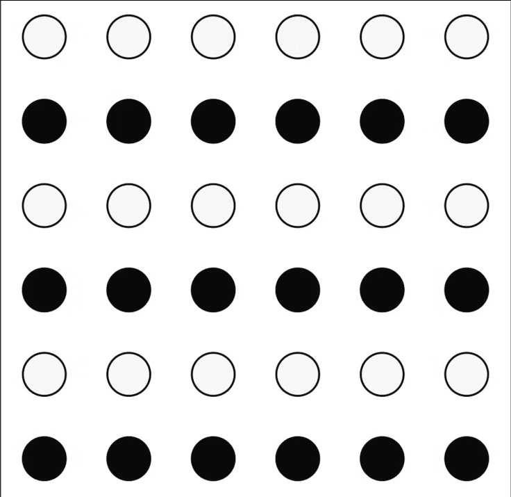
When we look at the picture provided, most of us would see rows of black and white dots instead of alternating columns of dots with different colors. This phenomenon demonstrates the law of similarity, where our brain tries to interpret the world in a logical and meaningful way.
Applying the law of similarity, we can use shapes effectively to enhance the information architecture of a page. By doing so, we help users comprehend the layout without overwhelming their cognitive load. This approach allows people to identify where the most critical information resides and intuitively understand the relationships between various elements on the page, all without relying heavily on explanatory text.
Designers can improve user experience by using Gestalt techniques and colour psychology. Colour-coding data helps users understand and group information easily. Understanding the law of similarity helps create more efficient and meaningful interactions.
When it comes to design, similarity goes beyond just shape, size, and colour. The direction, position, and choice of fonts also play a crucial role. By incorporating this principle, we can create interfaces that are easy to navigate and minimize mental strain for the user.
Happy Summer Holidays everyone!
We are Product Office, your friendly UX/UI neighbours.
If you’d like to learn more about user experience and user interface design, join our LinkedIn group (https://www.linkedin.com/groups/12005968/).
 Luigi Savio
 Marina Salvati
 Gaia Inangeri

 Davide Belotti
 Alandy Beanes de Azevedo